Thursday, November 29, 2012

graphic design

Now this is a very interesting interactive business card for perhaps an record company or anything relating to music- though if you added some way to make sound to this it would make it even more fun- this is one that i would keep around if i came across it keeping it memorable to who they are trying to connect with.

graphic design

Now how interesting is this a business card and a message to creativity this good work with many different fields from someone who is any kind of artist/creator to a music director even a band member trying to collect a following. I love the use of yellow its very bright vibrant color choice with the added double use of making this business card interactive.

graphic design

This has the cute and amusing factor going for it though i would maybe change the color choice for the sun glasses even making them cat eye in red. mustaches have become a fun selling point recently you can find them in so many different items that this would be a very popular business card. I would love to make something like this interactive card and would end up playing with it myself.

graphic design

Now this would have a very good selling point with everyone wanting to go green to have a card that you can recycle by growing something out of it. This could work for a hair dresser all the way to using it for a garden business. Its a cute multi purpose card that would be both fun and useful making an impression on anyone that gained one.

Wednesday, November 28, 2012

graphic design

This is just a group of business cards that i found though simple in design i was drawn to the geometric shapes and bold color choices the the orange and green especially.

graphic design

When i was looking at business cards this is one of them that jumped at of the search page for me. The use of orange is a very nice choice. I just love the boat that is in the cut away it would make for a nice business card for the kraken company though they might want to change the color pallet to black and white.

graphic design

haha i had to add these for the amusement factor that someone out there has a sense of humor though useless for a business they are quite fun and definitely note worthy. Im not sure though if the muted tones work well the top corner one though for the umbrella corporation is probably to me the one that works the best out of all of them. I like the blue that was used making the red and white of the logo stand out the most.

graphic design

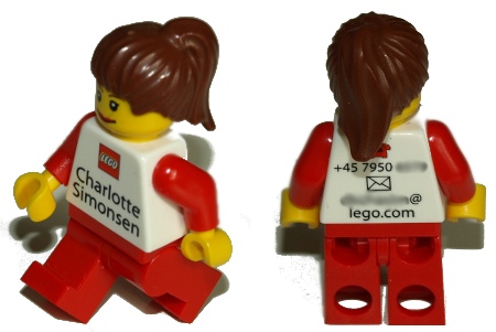
This is such an inventive use of a lego to create an interactive business card. This would be an interesting idea to use not for just those who work for the lego corporation but for someone that wishes for a memorable business hook. If i had an unlimited budget for such a thing i would have them create something custom for tomari graphics.

Tuesday, November 27, 2012

typography

when i posted this last night i did not get the idea till just now so this quite the amusing use of typography. The colors work well and the illustrations of the wood though very cartoonish work well with this type of presentation. I can see this on a tee shirt somewhere which has probably been done.

typography

This is a fun way to use typography using the lines of a record to create this very nicely flowing text.

typography

I love how the letters so very telling and creepy fits with Sweeney Todd theme Put that together with the graphical image of the razor it works so nice. The background left simple pulls it all together well.

typography

Wow even though its a bit hard to read in some places i love how they took a recipe for chocolate chip cookies and made a piece of art. The choice of colors works together so nicely the orange flowing into a middle ground then golden rod to that bright yellow placed on such a warm brown color, makes for a nice presentation piece.

typography

I added this because it takes something that i love and makes it something that i'm interested in relating to typography. The swan has such an inserting and wonderful shape to create this letter s i could see an whole alphabet made in this same way taking the natural shape of something and tweaking it just slightly to make a letter.

typography

I love how this use of typography geometric shapes creating this optical illusion. Down to the use of images in the word for homes of the future this was a very creative approach. 

typography


 I'm all about bright colors as well as images that look like there from the 80's this is quite the use of typography mixed in with this graphic element. The way super fly is written out with such an interesting flow of color fits together nicely.

graphic design

I love this first layout in the way that they kept the background in a bold black to complement the bold colors in the images. The sunflower in the middle is a nice focal point with the images circling around (in a circle form) a nice representation of the center of said sunflower.

I love this layout that was for this again the use of the paint bucket photograph that pours into the body of the information a creative approach would be interesting to use for a painting companies main page.

graphic design

I just love this image the use of orange and black is so vibrant and effective and quite interesting. I love how the the women's body flows into the wispy black that is also matched towards the bottom in the soft grey opacity to create a sense of flow.

graphic design

I just love the use of mixed techniques to create this face i wonder if they painted the model white before or painted her face after in photoshop. This would really be an interesting image to use for a make up company. Perhaps making the image more powdery and less like acrylic paint. Though its still a beautiful concept.

typography

http://vimeo.com/3600380
Wow after watching this video i was really inspired by the creative process and the use of typography to create an interesting piece of video art. It might be an interesting side project to create something using just words and letters (for the images) to create a inspiring art video well im off for winter break so practice practice practice.

typography

http://www.youtube.com/watch?v=IAVt-TDXq4g
This is another example of an interesting video with the use of typography though there is an image used the (the girl walking though the vid) here is the post under the vid copy and pasted to explain the meaning behind why it was createdUndergrad project using motion graphics portraying the unconscious mind drifting into a dream state and finally coming to awareness within it. 

Done entirely with After Effects, Illustrator, Photoshop, and logic pro. Blue screen footage shot specifically for project, thanks to actor Amy Meyers for her help acting. All other elements self generated. Actual size is 1080x720 at 29.97. This is from my scholarship show for the University of Northern Iowa.

Special Thanks to Andre Lipsey for the audio remix.
www.myspace.com/andrelipsey