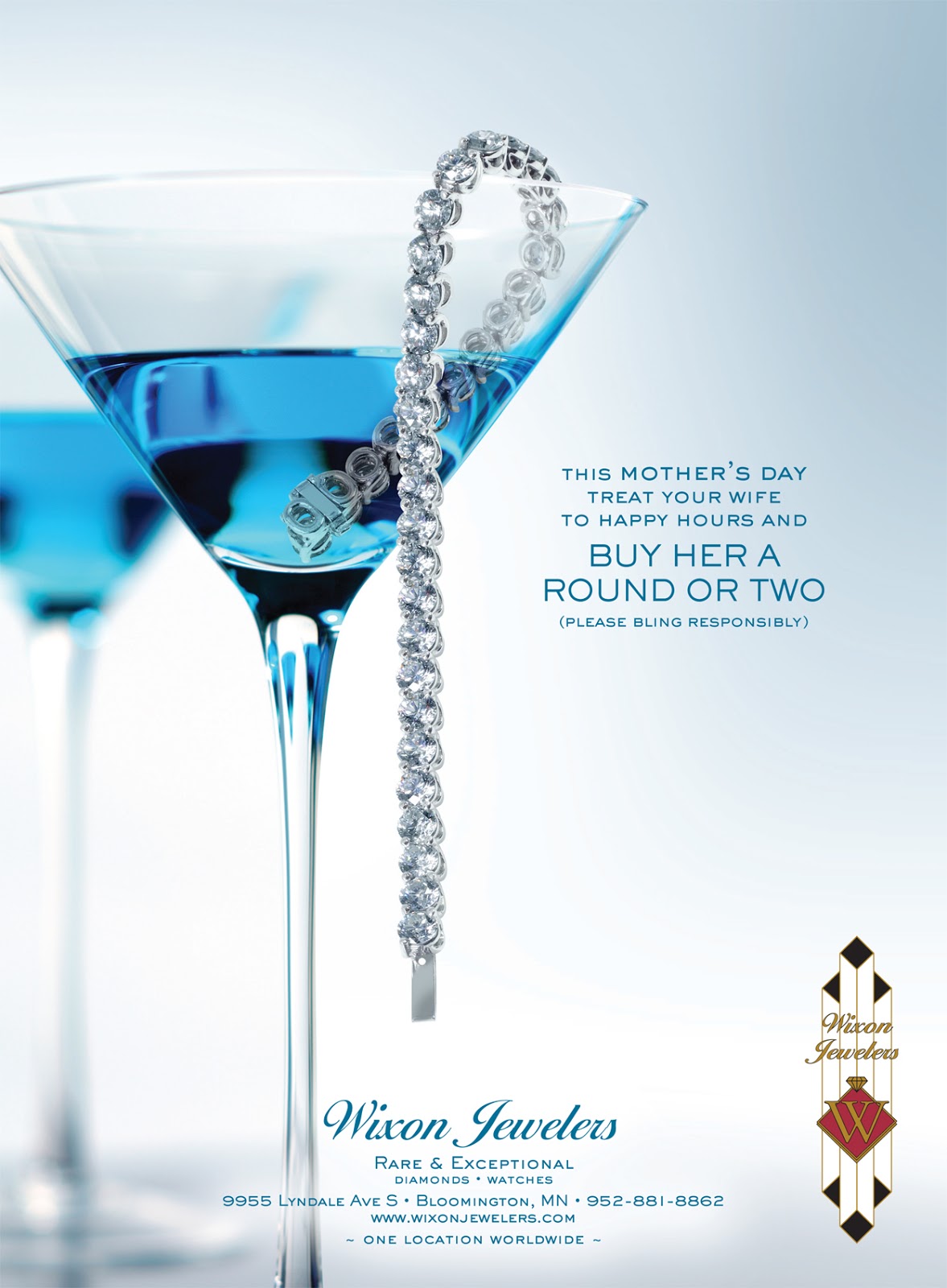
This simple design is very striking to the eye with the blue hits in both the glasses as well as background and typography makes your eyes follow around the page. The line of the bracelet is set in the glass so it points down to the important information on where to purchase. I like how they have the second glass faded back so as to keep the space from being empty but not to distract from there main image.
No comments:
Post a Comment